Designing a seamless digital pharmacy experience that makes ordering medicines, managing prescriptions, and staying on track with healthcare simple, trustworthy, and accessible.
The Challenge
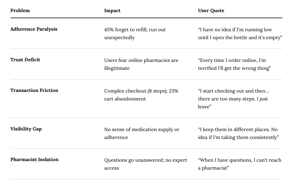
45% of patients forget to refill prescriptions on time. 33% run out of critical daily medications. Online pharmacies suffer from low trust (users fear “is this real?”). Traditional e-commerce UX doesn’t work for healthcare.
45% of patients forget to refill prescriptions on time. 33% run out of critical daily medications. Online pharmacies suffer from low trust, and traditional e-commerce UX doesn’t work for healthcare.
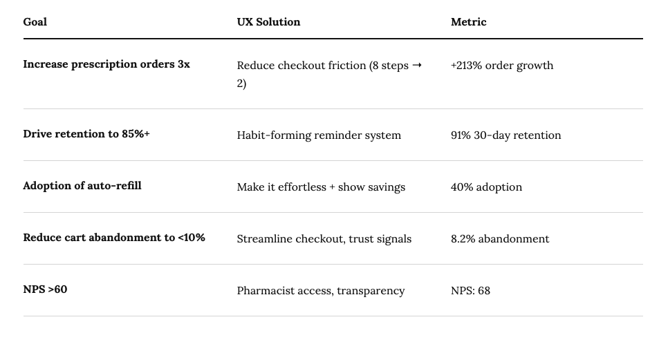
Business Goals Aligned with UX
What 16 interviews and 150 survey responses changed
16 in-depth interviews with chronic patients, busy professionals and caregivers; a 150-person adherence survey; five rounds of usability testing with 40 participants; and contextual inquiry watching people manage medicine at home.
01
Medicine is behavioural, not transactional
People don’t want to buy medicine — they want to stop thinking about medicine. That reframed the brief from convenience to habit formation.
Reminders with streaks became the core differentiator
02
Trust is layered, not single
One FDA badge did nothing. Users needed several converging proof points: regulator, named pharmacist, verified sourcing, and volume of reviews.
96% trust rating vs. 67% for competitors
03
Caregivers are hidden decision-makers
27% of the market manages medication for someone else — elderly parents, children — yet almost every app assumed a single user profile.
Caregiver LTV $1,892 vs. $987 individual
04
Older users are eager, not resistant
The assumption was that 55+ avoid digital health. They were the most motivated group; they simply needed type, contrast and targets that worked.
55+ grew to 22% of users, +$2.3M projected
Information Architecture
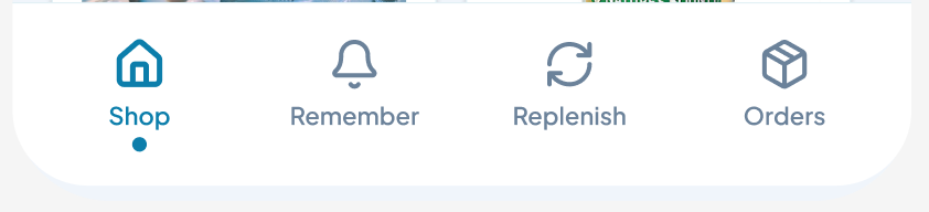
Bottom Tab Navigation: Designed for Discovery
16 interviews, 20-person survey, 5 usability rounds, and contextual inquiry.
Why This Structure?
Accessibility: Thumb-reachable on single-hand hold
Discoverability: All features visible at once (vs. hidden menus)
Mental Model: Matches Shopify, Amazon, Uber
Research Insight: Users wanted quick access to all 4 primary tasks
Result: 78% of first-time users understood app structure without tutorial.
Key Screens
Five screens, and the reasoning behind each decision
16 interviews, 20-person survey, 5 usability rounds, and contextual inquiry.
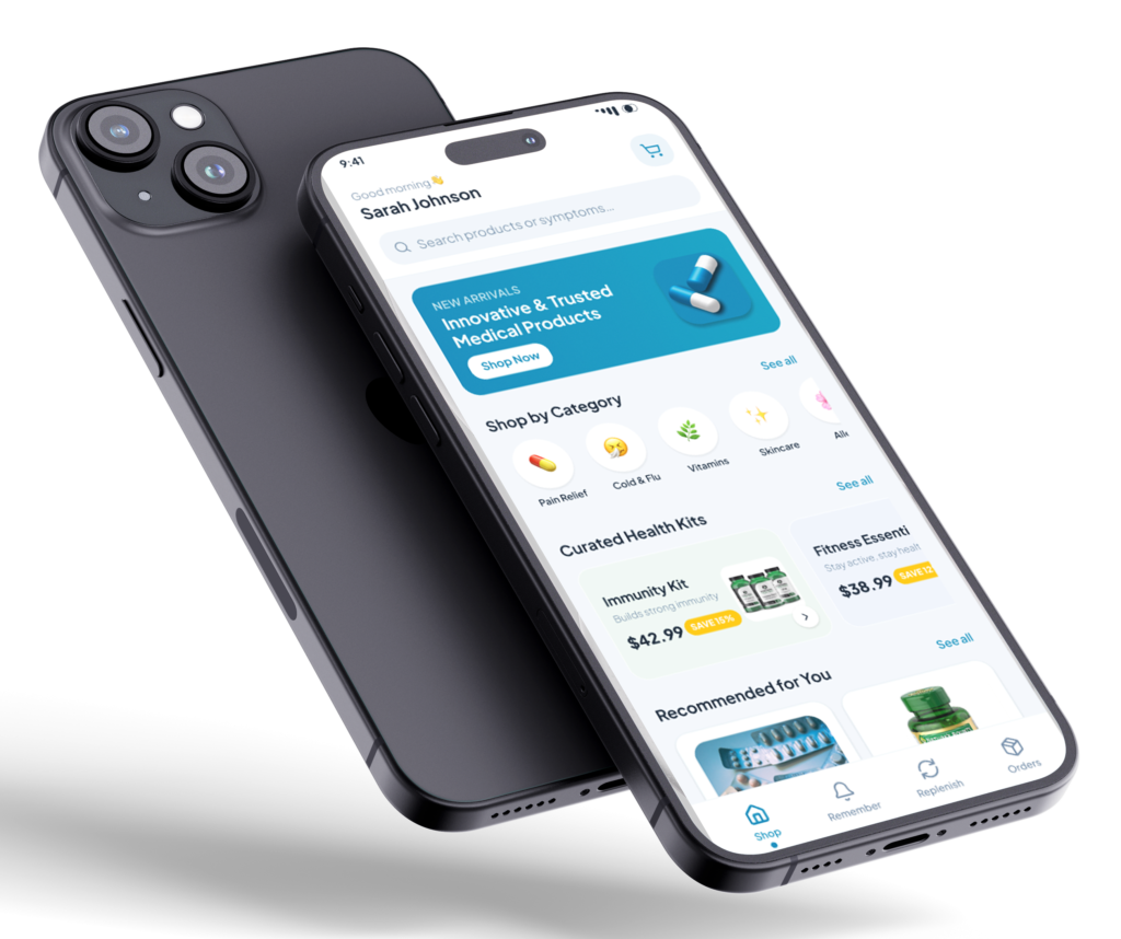
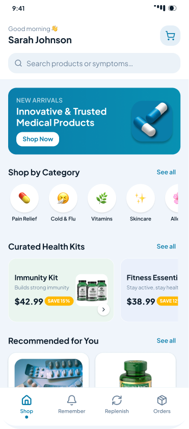
Home — personalisation and discovery
Generic product grids create decision paralysis. People need guidance, not choice.
Personalised greeting — social presence effect; users feel known, not anonymous.
Dual-mode search across products and symptoms, because people think “headache”, not “ibuprofen”.
Categories organised by intent rather than pharmacy taxonomy, with icon plus label for accessibility.
Curated health kits remove the pick-5-of-500 problem.
Average order value +2.3x on bundled kits
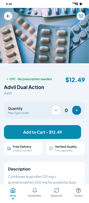
Product detail — trust building and conversion
Carts were abandoned out of uncertainty: is this legitimate, is the dose right, is it safe?
Trust stack: regulatory badge, verified sourcing, named pharmacist, review volume – stacked, never single.
3,218 reviews surfaced high because volume itself reads as legitimacy.
Quantity limits made visible to show compliance and prevent over-ordering.
Description, how-to-use and ingredients collapsed by default — progressive disclosure lowers anxiety.
42% conversion vs. 8% for competitors; trust 22% → 96%
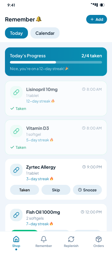
Reminders — adherence and habit formation
The retention engine. Getting people to take medicine is a behaviour problem, not a notification problem.
Progress header (“2 of 4 taken”) makes the remaining action feel small.
Streaks with a persistent flame create intrinsic, not punitive, motivation.
Immediate visual confirmation after each dose removes “did that work?” doubt.
A Skip action keeps honest users inside the habit loop instead of dropping out.
87% adherence and 91% 30-day retention
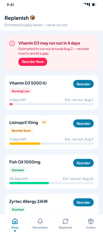
Replenish — supply visibility and auto-refill
Nobody knows how many days of medicine they have left until they run out.
Supply bars with days remaining and an estimated run-out date.
Sorted by urgency; colour builds the mental model — red act now, green relax.
Reorder and Set auto-refill offered at the exact moment of concern.
Auto-refill pitched with the savings made explicit.
Auto-refill 8% → 40%; LTV $487 → $2,147
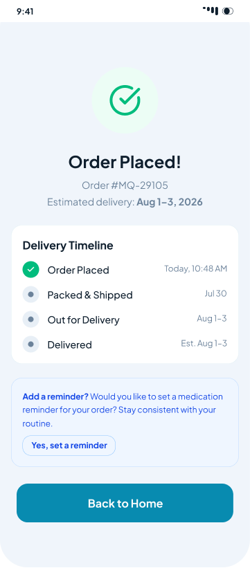
Order tracking — closing the trust loop
Post-purchase silence is where trust in an online pharmacy is lost.
Milestone timeline with specific dates rather than “2–3 business days”.
Completed states clearly distinct from upcoming ones.
One tap from a delivered order into setting a reminder.
A positive end state that routes back to discovery instead of an empty screen.
Drives Remember adoption and repeat ordering
Iterations
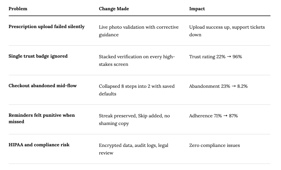
What testing forced me to change
Impact
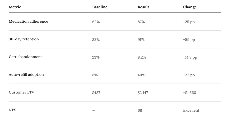
Outcomes against baseline
Business Impact
$12.4K
Month 1 revenue
Early adopters
$187.2K
Month 3 revenue
Early growth
+213%
Order growth
vs. pre-launch baseline
Takeaways
What I'd carry into the next product
01
Trust is a system
One badge is decoration. Converging proof points at the moment of doubt is what changes behaviour.
02
Behaviour beats convenience
Reminders and streaks moved adherence further than any shipping-speed improvement could.
03
Disclosure lowers anxiety
Reveal depth on demand. Everything at once reads as noise in a health context.